So Google have announced Android Wear. Currently it looks like it is going to be Google Now on your wrist, which actually could be really useful. Quick, glanceable information and alerts accessible without the need to pull your phone out of your pocket or bag.
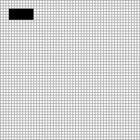
Two watches were previewed in the developer preview video. Motorola’s Moto 360 & LG’s G Watch. No specs have been released as of this posts writing, but from the images of the watches alone, a big issue has been identified. The Moto 360 has a round face, much like a tradition mechanical watch, which makes it stand out from the crowd of existing smart watches. The G Watch is similar to existing smart watches with a square face. Here in lies the issue. Most app developers or interface designers will tell you that a grid & coordinate system is used when layout out an interface on a screen. This is the grid of pixels used to make up the screen. Typically 0,0 in the top left and so on.
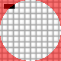
Simply, if you want to position an element near the top left of the screen, you would use the coordinates 3,3 which is based on the pixel grid.

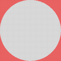
With a square screen, the grid is quite simple and obvious. Having a round screen complicates things. In effect, you start with a square pixel grid, then chop pixels off at the corners to make it a round pixel grid.

This means any app developers or interface designer will have to take this loss of screen space into account when designing their app, which is actually pretty obvious. What is not so obvious is how do they design/develop their app to make sure it is usable on all devices, regardless of if they have a round or square screen? What will stop a square apps design simply being cut off on a round screen?

It is going to lead to a few possible outcomes:
- All apps are designed for round screens to make sure nothing is ever cut off, so there will be lots of unused space in the corners of square screens.
- Apps will be designed for square screens and simply have some of their UI chopped of on round screens.
- Developers will have to design/develop two version of their apps. One for devices with square screen & another for devices with round screens.
None of these outcomes are ideal. They cause issues for developers & could lead to a poor experience for device users. In effect it could be the existing Android device screen size fragmentation issue, just moved onto smaller devices which are worn on users wrists.
It is hard to think of a simple solution to this. Developers & users are at the mercy of the device creators. Do you have any ideas?
